The concept art made a promise the prototype could not keep
A technically solid Unreal prototype was improving, but a side-by-side review exposed that its placeholder-heavy production plan could never reach the visual standard already set for the product.
The concept art for Lunar Dispatch showed a six-wheel rover moving through a dense industrial outpost, with long shadows, worn machinery, a relay tower, a habitat, and a sparse mission-control interface that made the operator’s decision feel important. I approved it as the visual North Star because it made the product legible before anyone had to understand the architecture underneath.
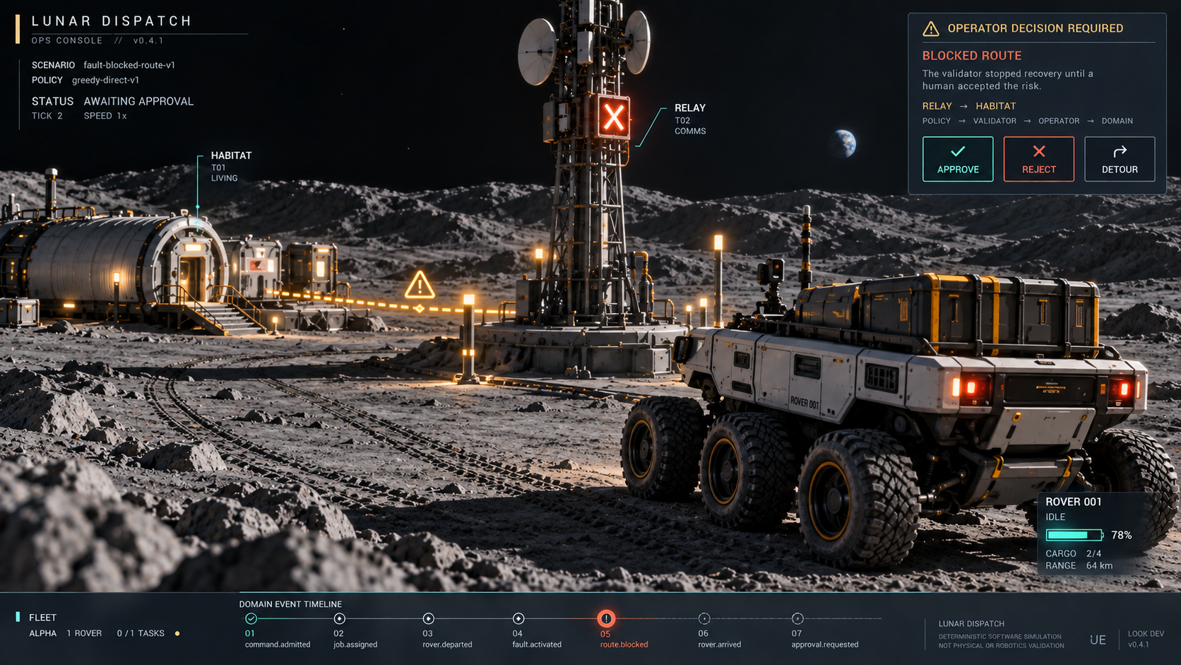
The approved concept established the hero composition and the visual promise.
The actual Unreal build was real, functional, and improving, but the side-by-side comparison was brutal. Its rover, habitat, and relay were still assembled mostly from engine primitives; the terrain was sparse, the materials looked flat, and the scene read as a dressed-up graybox rather than the world in the concept. The agent had described the first pass as substantially closer, though the images did not support that confidence.
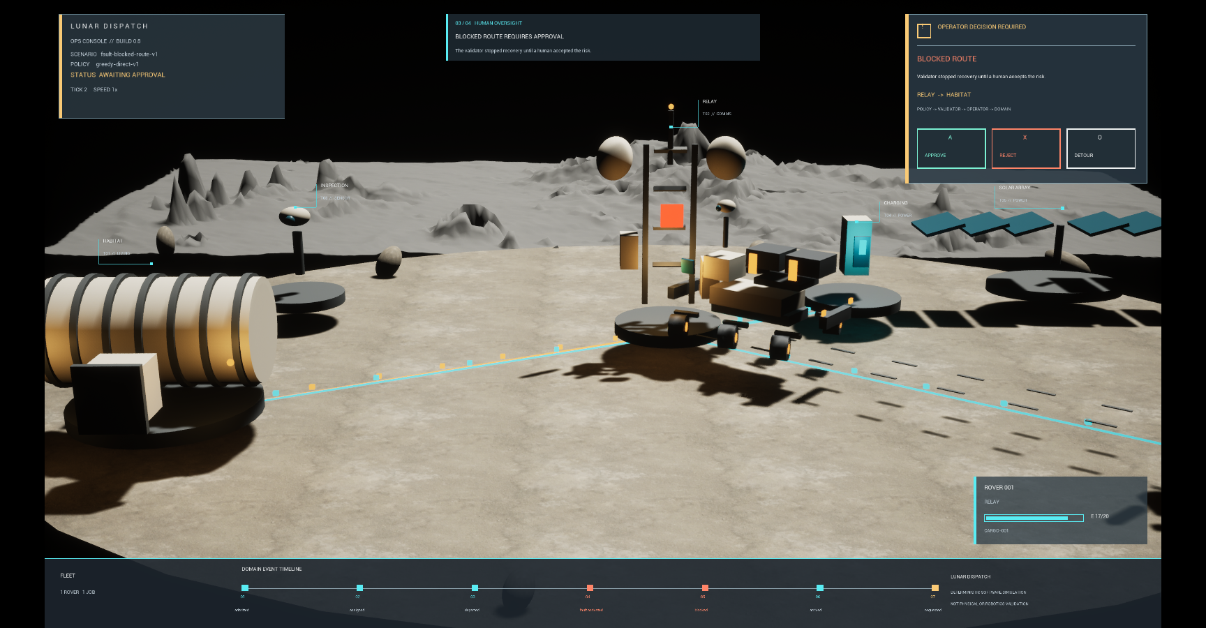
The first matched Unreal checkpoint improved the hierarchy, but its primitive-heavy assets exposed the production gap.
So I stopped the implementation and asked a narrower question before allowing another graphics pass: could this production approach truly get close to the concept, or were we polishing something structurally incapable of keeping the promise?
The working build was proving a different product
Lunar Dispatch is a deterministic autonomy simulator presented as a compact lunar operations game. Policies assign jobs to rovers, a validator blocks unsafe commands, a human approves recovery from an authored fault, and the full outcome can be replayed and compared. Unreal Engine makes that system visible, while the domain logic remains independent from frame rate, physics, and presentation effects.
That separation worked. The guided scenario reached the intended decision, all 38 zero-network tests passed, and the canonical simulation hashes remained unchanged through the visual work. The first overhaul also improved the camera, HUD hierarchy, rover silhouette, lighting, regolith material, and distant terrain without disturbing the evidence underneath.
Those results mattered, but they answered whether a stronger presentation layer could preserve a reliable simulator. The concept art was asking whether the presentation could make someone care about the simulator in the first place.
What the prototype had proved
- The simulation stayed deterministic
- Unsafe commands still reached a human gate
- The guided outcome remained replayable
- Visual changes preserved the tested domain
- The scene ran within its local performance budget
What the concept had already established
- A believable lunar-industrial identity
- Hero assets with readable purpose and scale
- Terrain density and material history
- A composed operator-decision moment
- A quality bar suitable for the public showcase
The concept frames were explicitly not production screenshots, nor did they promise a one-to-one reproduction of every generated detail. Nonetheless, they set an expectation for hierarchy, density, material language, and atmosphere. Once that standard existed, comparing the build only with its earlier graybox made progress look larger than it was.
The correction changed more than the next pass
The honest answer was that the fixed portfolio experience could get recognizably close, but not by continuing the same primitive-heavy shortcut. A few controlled camera compositions made the goal bounded; arbitrary gameplay views at the same quality would have required a much larger environment-art effort.
More importantly, the gap was not another lighting bug. It required proper hard-surface models, UVs, baked detail, surface wear, terrain dressing, production materials, final interface work, and repeated comparison against the approved compositions. AI could accelerate references, texture ideas, scripting, and parts of the modeling workflow, but it could not automatically convert placeholder geometry into a coherent world.
That distinction corrected the estimate. The work was no longer “one more graphics pass”; it had become a small asset-production project involving Blender, reviewed free resources, Unreal materials, lighting, camera composition, animation, interface design, and license provenance.
This is where visual feedback becomes a product decision rather than a matter of taste. “It still looks rough” invites indefinite polishing, whereas “this asset strategy cannot reach the approved composition” identifies a problem with scope, tools, and sequencing.
A beautiful reference can hide an expensive assumption
Concept art is cheap compared with the production system required to realize it. One generated frame can make a rover look engineered, give every structure a distinct silhouette, scatter convincing detail across the terrain, and balance a cinematic camera in seconds. The image compresses hundreds of decisions into a single result, though it says almost nothing about how those decisions will survive other states, camera positions, animation, performance limits, or an actual asset pipeline.
That makes concept art useful and dangerous. It can align a team around a product identity, but it can also smuggle in an estimate: if the reference looks coherent, the implementation may feel like a matter of reproduction rather than production. Each placeholder then appears to be a rough version of the final asset even when the path between them requires different tools and different expertise.
The same trap appears outside games. A generated dashboard can imply an information architecture the data model cannot support. A polished onboarding mockup can hide missing permissions, migration paths, or failure states. An AI-generated product video can sell an interaction before anyone has proven that the system can respond with the required speed or reliability.
The problem is not that the reference is aspirational. The problem is allowing aspiration to masquerade as evidence that the current plan can reach it.
One finished slice is an economics test
The revised plan did not begin by rebuilding every rover and structure. It reduced the visual promise to one approval-state composition: one cargo rover, the relay and habitat, the blocked route, surrounding terrain, final lighting, the real HUD, and the camera that connects them.
- Choose one product-defining composition
- List the visual claims it makes
- Replace the hero placeholders
- Finish materials, terrain, lighting, and interface
- Compare the runtime frame with the approved target
- Measure performance and preserve system truth
- Propagate the asset language only if the slice holds up
This slice is not merely a prettier milestone because it tests whether the proposed combination of tools, assets, time, and review can produce the quality being estimated. If it succeeds, the project gains reusable geometry, materials, lighting rules, interface patterns, and a credible basis for estimating the rest. If it fails, the failure arrives before weeks are spent spreading an inadequate approach across the whole environment.
As of this Note’s publication date, the visual overhaul is still in progress, so the hero slice has not yet proved that Lunar Dispatch can reach the concept’s overall quality. It has already produced a more useful result, though: the remaining gap is described as production work rather than hidden inside an optimistic progress report.
A prototype can be technically honest about what works and still create a misleading impression of how close the product is to finished. Concept art sharpens that risk because it makes the destination feel concrete; therefore, once the image becomes the quality bar, the estimate must include the pipeline required to make that image survive contact with the real system.